 (Via BoingBoing) |
Georgia’s Electronic Voting, from a UI perspective |
That having been said, it was a pleasure to use this system. I had no problems with the acutal use of the system: touch screen is a *great* choice, especially for handicapped & elderly users. Blind users pretty much can’t use it… but I think that as time goes on, having a “audio” version of the ballot (with headphones) would be an excellent alternative. The choices were clearly marked, and I had no problem with the system. It included a review page, and the opportunity to go back and fix problems.
Everything was clearly marked: incumbents were clearly marked, as was party affiliation. Names were also clearly placed at a reasonable type-size. Font face was a standard Arial-Helvetica type, which was annoying but understandable. Choices were also clearly marked: the touch area for each button was fairly large, making it easy to hit. (Ever try and use those stupid punch card pages? The punch card tools are about as unwieldy as a needle and thread. Using a finger instead is wonderful).
Here is the entire article in case the link goes bad at:
http://www.plasticnoodle.com/archives/000061.html#000061
PlasticNoodle
The shiny version of my brain!
November 05, 2002
Georgia’s Electronic Voting, from a UI perspective
CNN.com – Electronic elections: What about security? – Nov. 5, 2002
Let me go through a quick summary of the user experience for voting with the new Georgia touch-screen panels. This will ignore everything that you can think of in the way of security, just because that’s a hot debate that I don’t want to get into.
First, let me state: not everyone in Georgia is using these. Some places did opt to use the pull-lever voting machines for now. It’s just most of the state.
When I went in to vote, my name, address, and voting information was still being taken by hand. I went through 5 poll workers to get everything I needed, including the usual drivers’ license stuff. The major difference is that the retiree at the end of the line gave me a smart card, not a ballot.
I will say this: two years ago when I last voted, I accidentally messed up my ballot. Major pain; the poll worker had to cancel my ballot, re-issue me a ballot, and was very annoyed with me. So I was looking for resolutions to this problem, as well as a much better looking and easier to use experience.
The “ballot box”, for lack of a better term, is an approximatly 8 inch by 10 inch LCD screen, placed the long way, and leaning at about a 45 degree angle. Beneath the box and to the right is a “card holder”, which was at best a bad place. I’m 5’10”, and I didn’t see it until I stepped back for a second to find where the card went. On first impression I was expecting a swipe-card situation. But it’s a smart card, with a chip inside of it: it writes your choices to the card, so it’s got to hold onto it. Not the worst, but mentionable.
On finding the location for the card, I stuck it in… and got nothing for a few seconds. A sticker on the top read to stick it in until the green light goes on. The green light is beneath the card’s slot – so you can’t see it until it goes in. Icky. Place it on top so people can see it.
I read of reports where people were slipping it beneath the slot, in the space between the slot and the box. I didn’t experience the problem… but the elderly woman next to me did have problems placing the card into the box. Couldn’t lean over and watch to find out what the problem was, though: that’s polling places for you.
The screen was a Windows-based GUI. Touch the box next to your choice, and a big X appeared next to it. Definitely easier to read than a ballot. Changing the choice was also easy: touch the choice or another choice, and it switched. I dislike the Windows-traditional GUI in this setup — it’s black text on gray background. It definitely needs to be white on black. I’d rather it had more pleasing buttons than the traditional Windows buttons, but it didn’t affect the usability, just my sense of good taste.
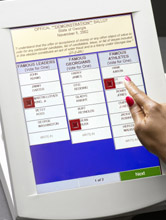
The buttons were a traditional 3-column ballot list. I still think the traditional 3-column ballot list is a horrid format. Each column is seperated with a thick border, while each column is seperated by thick borders seperating contents, and thin lines seperating individual choices. Between contests there is also a space, so it’s thick line, space, thick line between contests.
This, at best, is a poor explanation of the traditional ballot: suffice it to say, it’s a poor design. As you can see in the (linked) image, it’s three columns. What it doesn’t show is the gray on gray (the images shows a blue background) and the fact that each group for voting is placed right below one another, about 6 contests per page. Emulating the 3-column ballot was probably not the best choice. It works — but there’s better ways to do it. A 2-column list might have been interesting, and a little less confusing. A Full-page setup, with choices either going down or across 3 at a time might have been a better choice. Multiple pages works, although it definitley isn’t using the medium to it’s advantage. I wish they had tried letting the page scroll, it might have worked a little better.
That having been said, it was a pleasure to use this system. I had no problems with the acutal use of the system: touch screen is a *great* choice, especially for handicapped & elderly users. Blind users pretty much can’t use it… but I think that as time goes on, having a “audio” version of the ballot (with headphones) would be an excellent alternative. The choices were clearly marked, and I had no problem with the system. It included a review page, and the opportunity to go back and fix problems.
Everything was clearly marked: incumbents were clearly marked, as was party affiliation. Names were also clearly placed at a reasonable type-size. Font face was a standard Arial-Helvetica type, which was annoying but understandable. Choices were also clearly marked: the touch area for each button was fairly large, making it easy to hit. (Ever try and use those stupid punch card pages? The punch card tools are about as unwieldy as a needle and thread. Using a finger instead is wonderful).
Entering a write-in candidate is easy too – touch screen keyboard to allow you to type it in. Much easier than writing it, and it helps that the screen is at an angle; you can see it without having to put your wrists into a permanent arch. Standard QWERTY keyboard on a seperate screen, you just click on the write-in choice, and it moves you to that seperate screen.
One thing I did find poor about the interface was the final selection screen: it had problems with it’s scrolling. it took me about 3 minutes to go from the top of the list to the bottom… which would be on a desktop PC a one-click move, as it’s not a long page. That needs to be improved.
Another suggestion I would like to make goes toward improving the voting process overall: educating the people as to their choices. If you look at VoteSmart’s web site, you’ll find that many candidates refused to state their positions. That’s right: a non-biased, non-party affiliated group couldn’t get most candidate’s positions. Your average person has little or no chance to hear the facts and form an opinion on a candidate. But, in linking information to the candidate’s position — all candidates, equally — you might get a better educated electorate. Granted, it’s probably not currently allowed in most or all states, but it’s a thought. And it would help one of the most problematic issues with voting, voter education.
So, to sum up, it’s a pretty neat system with some room for improvement — but a definite good thing. Check it out at the Georgia Counts web site. They’ve got a demo to get a feel for it, and a ton of videos, which I haven’t looked at.
Posted by doones at November 05, 2002 07:08 PM
Comments
whine whine whine…
Posted by: on November 6, 2002 10:22 AM